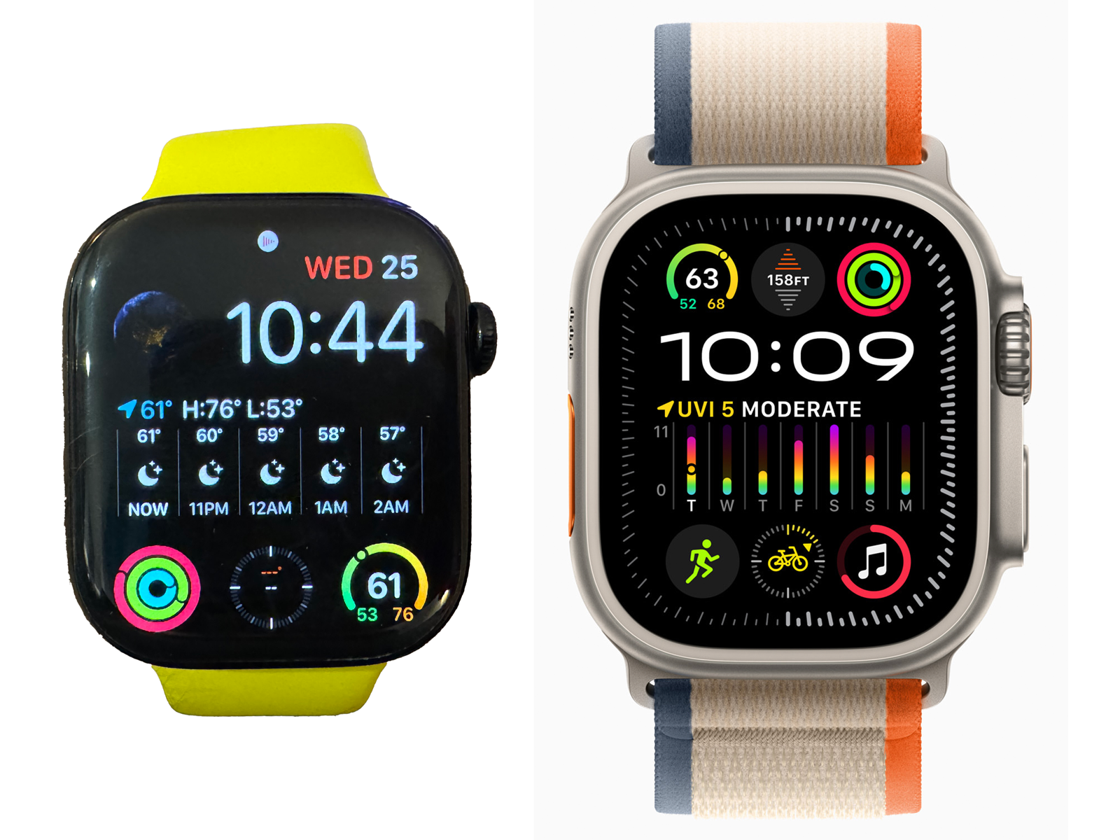
Well, I was excited for my new Series 10 Apple Watch because I thought I’d get to use all the new cool watch faces available now. Unfortunately, I quickly realized that the “Modular Ultra” watch face I’d been seeing in so many screenshots was an Apple Watch Ultra “ONLY” watch face…
Now I don’t need ALL the complications that the Modular Ultra face gives you, but can we please just get some better looking fonts? This new Series 10 screen is “technically” BIGGER than the Ultra screen. The face on the Ultra just looks so much cooler and makes the Series 10 modular face seem dated.
Very disappointed in this. I would consider returning my Series 10 and shelling out the money for an Ultra 2, but no way am I buying a year old smart watch… And I really don’t want that big bulky watch on my wrist…

